We all want a home that’s stylish, comfortable, and inviting. Some of us even spend hours scrolling through Insta-worthy design accounts, pinning rooms on Pinterest, and devoting way too much time to the latest home makeover shows. However, despite our best efforts, we often fall victim to common interior design mistakes that can leave a room feeling less than ideal.
So, we consulted interior design experts to learn more about the most common mistakes they see and how to fix them. From getting a little too matchy-matchy to investing in a too-small area rug to stay on budget, here are nine common interior design mistakes and easy tips on how to avoid them.
Common Interior Design Mistake #1: Purchasing a rug that’s too small for the room and its furnishings.
Selena Reif and Erin Anderson, the Southern California powerhouse designers behind Fleurish Interiors, notice many of their clients making the same common interior design mistakes despite having the best intentions. Topping the list—the wrong rug size. “A good rule of thumb is to make sure the front two legs of every piece of furniture are on the rug, and smaller pieces like coffee tables, ottomans, and benches should be completely on the rug. If it’s a rug in a dining space, make sure you can pull the chairs out enough for people to get on and off them while keeping the chair on the rug the whole time,” Anderson says.
Common Mistake #2: Pushing furniture to the walls of a room, especially in the living room.
To create more space, people tend to jam furniture against the walls. Unfortunately, this interior design mistake has the opposite effect. “Oftentimes we see a sofa or sectional shoved against a wall or corner, and it makes the room feel cramped, despite the thought that giving more space in the middle might do otherwise,” explains Reif.
But don’t worry—there’s an easy fix. The interior design duo advises clients to “pull your furniture off the walls to create some breathing room, and if there’s enough space, you can even add a console table or piece of furniture behind it to add depth and layer to your room.”
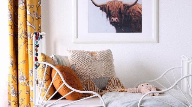
Common Mistake #3: Hanging curtains too low.
Many interior design mistakes stem from scale and how things are hung or positioned in a room. Here’s what Reif and Anderson suggest: “Hang your curtains high and wide. Rather than placing the curtain rod just above and slightly wider than the window, we like to go up almost to the ceiling (if it’s an 8’-10’ ceiling) and give enough width to the rod that when open, the curtains can bunch to the sides of the window while only overlapping the glass by a couple of inches. This gives the room height and creates the illusion of a much wider window.”
Related: A Stylist’s Guide to Creating a Kid-Friendly Living Room
Common Mistake #4: Don’t be too matchy-matchy.
Ideally, you want a room to coordinate but not match. Rooms that look collected over time and feature a variety of tones, textures, and materials always look more stylish than rooms that look like they could have been purchased all from the same store. Reif’s takeaway, “We know they do make the bed and nightstands and dresser all in a matching style, but choose your favorite piece and only get that one. Then pick complementary pieces for the rest of the furniture so the room feels thoughtful and collected.”
Common Mistake #5: Believing that new is always better.
Designers will tell you that nothing dates a room more than everything being from the same era. Anderson says, “Just like you wouldn’t want all the furniture in your room to be from the same set, you wouldn’t want everything to be brand new, either. Add in some vintage. Bringing in something aged or timeworn helps to bring character and a beautiful texture to your space. It doesn’t need to be a big or expensive piece. Think planters, accessories, or even art!”
Common Interior Design Mistake #6: Outdated hardware.
Interior Designer Melanie Raver, owner of Rave Interior Design, shares a common interior design mistake that’s easy to fix and won’t break the bank. “Clients often keep their hardware on cabinetry in the kitchen, bathroom vanities, and dressers way too long. Replacing it with something you find at local hardware stores, Amazon, or even thrifting it at your local Goodwill can add character and immediately elevate your space.”
“For kitchens, go classic and streamlined; for dressers, go bold and fun! Update kids’ dressers or nightstands with fun floral knobs or big, bold, colorful balls. Don’t forget the door hardware as well. You can easily change out a door knob for a more modern look with a flat round gold or go for a vintage vibe with brass and glass. The possibilities are endless!” suggests Raver.
Common Mistake #7: Hanging art that’s too high or too small for a room.
Some designers suggest hanging art at eye level so you never have to strain your neck to see it. Another trade trick is to move your eye vertically up the wall, imagine the wall divided into four sections, and then place the art in the third quadrant, counting from the floor up. Also, try to fill as much of the wall as possible with art; if it’s a collection, orient it in the shape of the wall.
When hanging art over a sofa or headboard, the rule of thumb is to start with 5″–8″ between the top of the furniture and the bottom of the art. Of course, it depends on the size of the art piece and how much space exists between the furniture piece and your ceiling, but you can always start here and readjust.
Common Mistake #8: Bad lighting.
Even the most beautiful space looks a bit scary under fluorescent overhead lights. Always consider both natural and artificial light sources when designing a space. You won’t regret the money you invest in the bulbs and fixtures that give off the most flattering light. The most common mistake is people relying on one light (usually overhead) when good lighting is achieved by multiple sources at different heights throughout your home.
Common Interior Design Mistake #9: All trim is painted white.
One common painting faux pas often overlooked is not being intentional about the color of your trim (including crown molding, wainscoting, baseboards, etc). Design expert Raver suggests opting to “color drip” rather than having all the trim in your home painted white while the wall is painted a color. “Painting the trim or molding the same color as the wall makes it look more custom and contemporary. We don’t want the white of the trim to break apart the wall into sections, and it tends to look like an afterthought that was added rather than built in,” advises Raver.