While selecting artwork is a subjective adventure—filled with whimsy, creativity, and personal taste—hanging it on your walls is where the practicality kicks in. Think of it as the intersection of aesthetics and precision, where following a few hard and fast rules can tie everything together and elevate your space. To help, we consulted a few interior design experts to get their advice on the art (or science!) of hanging art. Whether it’s not balancing proportions within the room or hanging pieces at the wrong height on the wall, here are seven common mistakes people make when hanging art and easy tips on fixing them.
Common Mistake #1: Not Measuring & Mapping First
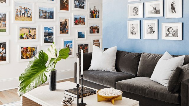
Common Mistake #2: Overcrowding On a Gallery Wall
Everyone loves a good gallery wall, and Kuo agrees that “they’re especially sweet in children’s rooms because you can incorporate your kids’ own art and family photos amongst art that they love!” However, one mistake she often sees is “crowding pieces too close together on the wall.”
It’s important to recognize that “before everything has been hung in its proper place, your brain, and eyes can trick you into thinking a six-inch space between art pieces is just a massive gulf and it won’t feel like the pieces are meant to go together—you should ignore this feeling!” Kuo suggests stepping back once you have all your items mapped—you’ll realize that four to six inches is a nice amount of breathing room between individual pieces.
Common Mistake #3 When Hanging Art: Not Taking Proportions Into Consideration
When hanging art, it’s important to consider the room as a whole to create a visual balance between art and furniture. Stacey Clarke, B2C Furniture’s Interior Stylist, shares that, as a general rule of thumb, the hanging art should be about two-thirds of the total width of the furniture beneath it. Think of the furniture as a platform for the art, and if it goes beyond it, it will immediately look off-balance.
Related: 9 Interior Design Tips Based on Common Mistakes People Make
Common Mistake #4: Hanging Art Too High
Interior designers agree that hanging artwork too high is a common mistake they see when visiting homes. Thankfully, there’s an easy fix. A steadfast rule for hanging stand-alone art pieces is to place the center of the artwork 57″-60″ from the floor. This height places the art at eye level so people can comfortably view it without straining. To find the artwork’s center, divide its height and width in half.
Of course, some exceptions exist, but in this case, even the exceptions have helpful guidelines to follow. Aim for the lower end of the range if most members of your household are on the shorter side; in rooms with ceilings higher than eight feet, you can hang artwork a little higher than 60 inches off the floor. Once you pick the midpoint, however, stick with it for consistency. Remember, the amount of space that appears above your art doesn’t matter nearly as much as the amount of space that appears below it.
Last tip—if you’re hanging art above furniture, you want the art and the furniture to feel like a cohesive unit and visually connected as a whole. To achieve this, it’s recommended to hang the art so the bottom of the frame is mounted five to eight inches above the furniture. This applies to sofas, consoles, sideboards, dressers, or any table or stand.
Common Mistake #5 When Hanging Art: Treating Multiple Pieces Separately Rather Than as One Piece
When hanging multiple related artworks, such as a set of framed prints or a gallery wall, envision the collection as one piece of art rather than individual pieces. Arranging the artworks together as a single, intentional display creates a more visually striking and impactful presentation.
Clarke says, “Art works best with cohesive diversity.” You’ll create a more curated look by keeping pieces similar in tone and intensity; this helps avoid the common mistake of randomly hanging pieces, resulting in a disjointed, haphazard look that detracts from the overall aesthetic. Also, when considering proportions, you should consider the collective size of all the pieces together.
Common Mistake #6: Choosing Art That Is Too Small for the Space or the Wall
Art that is too small for the space makes the entire room—and the furnishings in it—feel out of balance. This doesn’t mean you can’t include small pieces of art on your wall; it just means you may want to hang multiple pieces and treat them as one. Whether it’s one piece or a collection, artwork should be two-thirds of the total width of the wall or the space above furniture. Designers agree that slightly too big is always better than going too small.
Common Mistake #7: Not Orientating the Artwork to the Wall
Generally, the piece of art or the collection should be in the same shape and orientation as the wall it is trying to fill. On a wide wall, a landscape piece will usually look more natural and balanced. Hang portrait-orientated artwork on narrow walls to fill the vertical space—stacking smaller pieces looks great on skinny walls. Paying attention to how the artwork’s orientation interacts with the wall can elevate the overall look and tie into the room’s overall feel.